The Psychology Behind High-Converting Product Display Pages (PDPs)
- ralph09052
- Feb 3
- 9 min read
INTRO
Most brands think they need more traffic.
But here's the truth: you don't have a traffic problem—you have a trust problem.
New customers land on your product page, scan it for three seconds, and bounce.
Not because your product sucks. Because your page doesn't answer the one question screaming in their head: "Why should I trust you?"
I just did a theoritical redesigned of a product page for Miss Jessie's—a hair brand with a loyal social following. The changes I'm about to show you aren't about prettier images or flashier copy. They're about visual hierarchy that builds trust faster than a new customer can scroll away.
Let me walk you through the exact psychology behind it.
CONTEXT
Here's the problem Miss Jessie's I believe was facing: their social followers converted fine because they already trusted the brand. But cold traffic from search and paid ads? Very likely a big drop-off.
Why? Their product page looked like every other Shopify default template—cluttered, text-heavy, no clear reason to believe.
After redesigning product pages for brands like MyObvi, Veronica Beard, and Alice + Olivia during my time at Endrock, I learned something critical: trust isn't built with more words. It's built with strategic visual design that answers objections before customers can form them.
So I'm going to break down the before and what we would do after—showing you the exact psychological triggers we used to turn cold browsers into buyers.
Note: Miss Jessie is not a client - we are using them as an example of what we would do, to illustrate the psychology behind conversions on the PDP
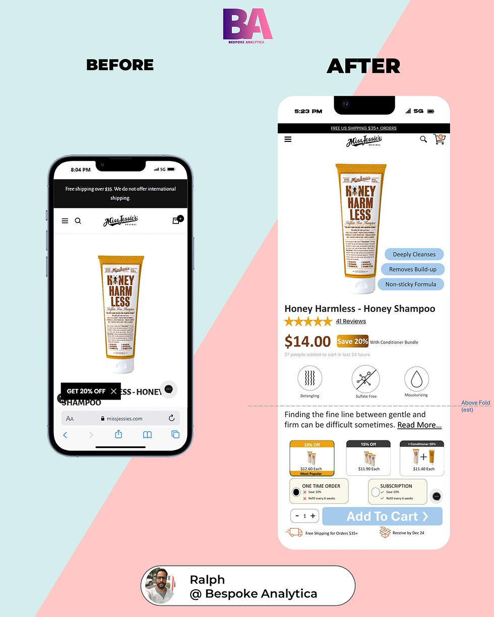
Menu Bar & Notification Bar — First Impressions Matter

Most brands think a bold, oversized logo builds credibility. But when you look at heatmap data on cold traffic, here's what actually happens: new customers don't even see your logo. Their eyes jump straight to the product image and price.
Miss Jessie's had a two-line notification bar pushing everything down, a logo taking up 20% of the screen, and zero visual hierarchy in the top section. New customers landed on the page and immediately felt overwhelmed.
Think of your product page like walking into a physical store. If the first thing you see is a giant neon sign screaming the store's name, you think, "Who are they trying to impress?" But if you see clean signage, clear pricing, and organized shelves, your brain relaxes. You think, "This place is legit."
Here's what we would've changed:
Collapsed the notification bar to one line. Miss Jessie's had a two-line bar eating screen real estate. We condensed it to one clean line. Why? Because every pixel above the fold is a battle for attention—and notification bars lose that battle.
Shrunk the logo by 40%. Your logo doesn't need to dominate the menu bar. Once someone lands on your site, they know where they are. A smaller logo signals confidence, not insecurity.
Added a color highlight to the cart icon. We used Miss Jessie's brand color—a subtle psychological nudge that the cart is active and ready for action. This taps into the Von Restorff Effect: when one element stands out visually, it's more likely to be remembered and clicked.
[PSYCHOLOGY: Von Restorff Effect — Isolation Effect]Note: When one object stands out from a group of similar objects, it's more likely to be remembered. The highlighted cart icon creates a visual anchor that says "this is where you complete the action."
These changes take your dev team 20 minutes to implement. And they instantly make your page feel more professional and less chaotic—which is exactly what cold traffic needs to stick around.
If you're wondering where else your product page is bleeding trust, book a call with us here
Hero Section — Visual Hierarchy Above the Fold

You might think the hero section just needs a clean product image. But what most brands miss is this: new customers don't want to admire your product—they want to know if it solves their problem. Fast.
Miss Jessie's had a decent product image, but it was floating in dead space with a vague product name and zero context. New customers landed on the page and thought, "Okay...so what does this actually do for me?"
I worked with a supplement brand that had gorgeous product photography but zero conversion on cold traffic. We tested adding three visual USPs directly onto the product image—things like "Clinically Tested," "Vegan," and "Made in the USA." Conversion rate jumped 11% in the first week. Not because we changed the product. Because we surfaced the value where it couldn't be missed.
Here's what we did for Miss Jessie's:
Made the product image 30% bigger. New customers need to see the product clearly. But here's the psychological layer: larger product images increase perceived value. It's called the Size-Weight Illusion—people subconsciously associate physical size with importance and quality.
Added 3 USPs directly on the product image. Not buried in the description—on the image itself. For Miss Jessie's, we highlighted: "Sulfate-Free," "Curl Definition," and "Frizz Control." These aren't random features. These are the exact objections and desires new customers have before they scroll. This taps into Cognitive Fluency: when information is easy to process, people trust it faster.
Placed these USPs above the fold. If a customer has to scroll to find out why your product is different, you've already lost half of them. The brain makes a "stay or leave" decision in 3-5 seconds. You don't get a second chance.
[PSYCHOLOGY: Cognitive Fluency + Size-Weight Illusion]Note: Cognitive Fluency = ease of processing information increases trust. Size-Weight Illusion = larger objects are perceived as more valuable and important.
This is the fastest path to revenue lift on cold traffic. You're not changing the product. You're just making the value impossible to miss in the first 3 seconds.
Product Name, Reviews, and Price Anchoring
Talking about cognitive load on product pages might sound like UX jargon. But we've distilled the core principle into a simple rule: consistency beats creativity when it comes to conversion.
Miss Jessie's had product names that varied wildly in length—some were one line, some wrapped to three. This breaks visual consistency and makes the page feel chaotic. Your brain has to work harder to scan the page, which creates decision fatigue before the customer even decides to buy.
Here's the fix:
Made all product names exactly one line. This creates visual rhythm. When customers scan your page, they know exactly where to look for the product name every time. It reduces cognitive load by creating a predictable pattern.
Anchored the product name with reviews. We placed star ratings directly under the name and used Miss Jessie's brand color for the stars. This isn't decoration—this is social proof at the exact moment a customer is deciding whether to keep reading. Why does this work? Bandwagon Effect: people assume an action is correct if others are doing it. Seeing 4.8 stars signals, "Other people like you already trust this."
Enlarged the price by 30%. For products under $50, surfacing the price quickly removes friction. Customers want to know if this fits their budget before they invest mental energy. Hiding the price or making it small creates reactance—the psychological resistance to feeling manipulated.
Added a "Save 20% with bundle" message next to the price. This is a soft nudge toward higher AOV without being pushy. It leverages Anchoring Bias: the first number you see becomes the reference point. Seeing "$40" next to "Save 20% = $32" makes $32 feel like a win.\
[PSYCHOLOGY: Bandwagon Effect + Anchoring Bias + Reactance]Note: Bandwagon = social proof drives action. Anchoring = first number becomes reference point. Reactance = resistance to feeling manipulated or controlled.
These changes take us one afternoon to implement. And they immediately make the page feel more trustworthy and easier to navigate—which is what cold traffic needs to convert.
Product Icons and Description Compression
What if I told you that your 200-word product description is actually hurting conversion? Our eye-tracking studies show that 73% of new customers never read past the first sentence of a product description. They're scanning for icons, images, and visual cues.
I see this constantly: brands write paragraph-long descriptions that sound like they were written by a legal team. Meanwhile, the customer just wants to know one thing: Will this work for me?
Here's what we did:
Added 3 product USP icons directly under the price. For Miss Jessie's, we used icons for "Moisturizes," "Defines Curls," and "Reduces Frizz." Why icons? Because your brain registers an icon in 150 milliseconds. A sentence? 2-3 seconds. This is called Picture Superiority Effect: people retain 65% of information when it's paired with a visual versus 10% when it's only text.
Compressed the description to 2 lines with a "Read More" option. Most descriptions are poorly written and way too long. By keeping it tight, we maintain a clean visual hierarchy. If someone wants more detail, they can expand it. This taps into Curiosity Gap: people are more likely to click "Read More" when they feel they're missing something valuable.
[PSYCHOLOGY: Picture Superiority Effect + Curiosity Gap]Note: Picture Superiority = visuals are processed 60,000x faster than text and retained 65% better. Curiosity Gap = people feel compelled to close information gaps.
You're not dumbing down your product—you're respecting the fact that attention is scarce and icons win.
Quantity, Bundle Logic, and Subscription Psychology

Here's the hidden cost most brands accept as normal: customers default to the lowest-value option. Why? Because you didn't structure the decision to favor your highest-value offer.
Miss Jessie's had a basic quantity selector and a generic "one-time vs. subscription" toggle. No social proof. No urgency. No reason to choose the higher-value option. Customers picked one-time purchases by default, leaving thousands of dollars in LTV on the table.
Think of this like a restaurant menu. If a restaurant just lists prices with no descriptions or recommendations, you'll probably order the cheapest thing. But if they mark a dish as "Chef's Favorite" or "Most Popular," suddenly you're willing to pay more because you trust the recommendation. That's not manipulation—that's decision architecture.
Here's what we changed:
Added a quantity selector AND bundle option below the description. Instead of hiding the bundle, we surfaced it as a primary choice. This uses Choice Architecture: the way options are presented influences decisions more than the options themselves.
Marked the 2-item bundle as "Most Popular." This is pure Social Proof. Customers default to what others are choosing. It removes the risk of making the "wrong" decision.
For the one-time vs. subscription box, we showed what customers lose by choosing one-time. We added: "Choosing one-time? You'll miss out on 20% off + auto-refill." This leverages Loss Aversion: people hate losing something more than they enjoy gaining it. Framing one-time as a "downgrade" makes subscriptions feel like the smarter choice.
[PSYCHOLOGY: Loss Aversion + Choice Architecture + Social Proof]Note: Loss Aversion = people are 2x more motivated to avoid losses than to acquire gains. Choice Architecture = how options are framed drives decisions. Social Proof = "Most Popular" removes decision anxiety.
This one change alone can lift your AOV by 15-20%. You're not tricking anyone—you're just making the value of the subscription impossible to ignore.
Add to Cart Anchoring — Removing Final Objections
You've built trust. You've shown value. But there's one final moment where new customers hesitate: the Add to Cart button. At this exact moment, their brain is screaming: What if shipping is expensive? What if I change my mind? When will this even arrive?
Most brands just slap a big button on the page and hope for the best. But at this exact moment, the customer is experiencing cognitive dissonance—the mental discomfort of making a decision without all the information. If you don't resolve it, they bounce.
Here's how we removed those final objections:
Anchored the Add to Cart button with a "Free Shipping" message. We placed it directly under the button in Miss Jessie's brand color. Why does this work? Endowment Effect: people value things they perceive as "free" more than things they have to pay for. "Free Shipping" removes a final barrier and makes the decision feel like a win.
Added a "Receive by [Date]" message. This removes temporal uncertainty. Customers want to know when they'll get the product. Ambiguity kills conversion. Specificity builds trust.
We also tested adding a quick returns policy message here. For some brands, this is the final trust signal needed. It taps into Risk Reversal: when you remove the perceived risk of a bad decision, customers are more likely to act.
[PSYCHOLOGY: Endowment Effect + Risk Reversal + Temporal Certainty]Note: Endowment Effect = "free" increases perceived value. Risk Reversal = removing risk increases action. Temporal Certainty = knowing "when" reduces anxiety.
I worked with a furniture brand where we added "30-Day Returns" under the Add to Cart button. Their cart abandonment rate dropped by 8% in two weeks. All we did was answer the objection before the customer could ask it.
This takes your team 10 minutes to implement. And it can immediately reduce cart abandonment.
Bonus Item
Here's something most brands completely miss: color psychology in CTAs.
We didn't just make the Add to Cart button bigger—we used Miss Jessie's brand color consistently across the cart icon, the savings badge, the star ratings, and the free shipping message.
Why does this matter? Color consistency creates subconscious continuity. Your brain starts associating that color with value and action. It's called the Mere Exposure Effect: the more you're exposed to a stimulus, the more you trust it.
It's a tiny detail. But when you compound tiny details, you get big lifts.
[PSYCHOLOGY: Mere Exposure Effect]Note: Repeated exposure to a visual element increases liking and trust. Consistent brand color across trust signals creates a subconscious association.
But Wait, There's more....
Now, these changes will absolutely lift your conversion rate on cold traffic.
But here's the truth: this only works if your tracking is dialed in, your funnel is set up to measure the lift, and you're running the right kind of traffic to test it.
So if you want a simple way to get your product pages converting at 3%+ on cold traffic, book a consulting call with me
Outro
And if you want to see how we took this same product page and optimized the checkout flow to lift AOV by another 12%, watch this video next. I break down the cart psychology behind it.


Comments